Wednesday, 29 January 2014
Production: Magazine Progress #1
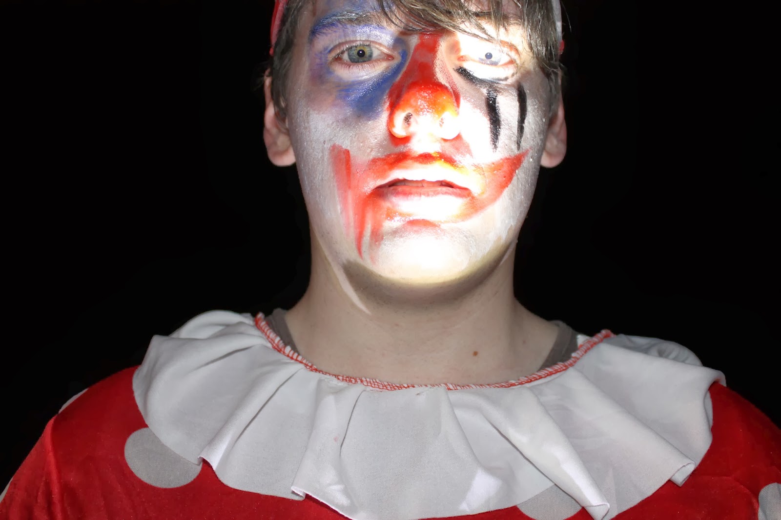
This is the first progress of my Magazine 'Feature'. I have used a very drastic image of the clown, where the lighting is only catching certain parts of his face, this gives off a very dramatic feel to the magazine. I have used quite a thin font for the title, which after some feedback I am going to change as it is not eye-catching enough and the colours that I have used, although contrast nicely with the image, just aren't vibrant enough for the magazine to stand out.
Monday, 27 January 2014
Tuesday, 21 January 2014
Production: Trailer Progress #1 (non-edited)
This is the unedited version of our trailer "The Carnival". It has got all of the footage on it, with no editing. We filmed it on a DSLR Camera but we used a shaky 'handheld' camera effect which we have seen in many other horror films. We decided to go with this effect because we think that it makes it scarier as if you're actually there, because you're seeing it through the eyes of someone who is 'just like you'. We tried many different shots and angles to make sure that we had a variety. However I think that we need to add something more, maybe with stable camera shot and tripod, to give our trailer that extra diversity.
Production: Poster Progress #2
After having audience feedback, I have decided to change my poster quite drastically. I have got rid of the side profile of the girl as in feedback a few people have said that it does not fit as she does not look 'scared' which wasn't the original purpose of having her there but if my audience says that it doesnt look right then I need to listen and provide. I also changed the font of 'The Carnival' as some people said that it looked too 'Disney-esque', which it was as it was an Alice in Wonderland font that I downloaded. We also used it for our production company logo font so we can not use the same thing.
Thursday, 16 January 2014
Production: Poster Progress #1
This is the first progress of my Movie Poster. I have used the clown and the main protagonist as the main features. They are both facing sideways as if they are looking straight at eachother which gives a eerie feel. However after some feedback, I have noted that she doesn't look scared enough and if I were to get another image where she looks scared the poster would be better.
Research and Planning: Audience Feedback
Today in lesson we shared all of our work that we have completed so far including the rough cut of our Trailer, the rough edit of my poster and I could not show my magazine as I had not yet started the process. A lot of the bad feedback that I received was about the incompletion of both of my things, which is a bit obvious if you ask me, although some of the feedback which I received was helpful and will aid in the creation of all of my medias.
The trailer feedback was added to Emma's cards which I read over to make sure that I knew what the audience wanted from our trailer as I am the editor. A lot of the feedback that we got from the trailer was unfortunately people misunderstanding a lot of our trailer. Somebody commented on the 'unstable' camera which we used but that was the effect that we were going for, we are trying to make the trailer look like it is being filmed from the prospective of our main protagonist. However they might not have understood the meaning behind this as we have yet to edit the clips into the right order etc so they might be confused. Somebody also mentioned the fact that you can see the torches which we need to 'edit out', however this was also intentional as it is meant to be part of the narrative that they are going out and looking around this scary looking farm with their torches.
However, we will take into consideration every piece of feedback that we receive and we will work towards having the perfect horror trailer.
Monday, 13 January 2014
Subscribe to:
Posts (Atom)